In March 2026, the “Analog Revival” has made calligraphy a popular antidote to screen fatigue. However, many beginners approach the art as if it were simply “fancy handwriting,” leading to early frustration. Calligraphy is not writing; it is drawing letters using a specific set of physical mechanics.
Whether you are picking up a pointed pen, a broad-edge nib, or a modern brush pen, here are the most common pitfalls and the 2026 “Pro-Fixes” to help you master the craft.
1. The “Death Grip” (Pressure Mismanagement)
The most common mistake is holding the pen too tightly. In calligraphy, the energy should flow from your shoulder and forearm, not just your fingers.
- The Mistake: Gripping the pen until your knuckles turn white. This leads to shaky lines and hand cramps within ten minutes.
- The Fix: Imagine you are holding a small, fragile bird. Your grip should be firm enough to control the tool but light enough that someone could pull the pen out of your hand with minimal resistance.
- 2026 Tip: Practice “Ghosting”—moving your pen in the shape of the letter a few millimeters above the paper before actually touching the nib down.
2. Ignoring the “Rule of Downstrokes”
Beginners often apply pressure at the wrong times, resulting in “blobs” or uneven letterforms.
- The Mistake: Applying heavy pressure on the upstroke.
- The Fix: In almost all calligraphic styles (Pointed Pen and Brush), the rule is: Light on the Up, Heavy on the Down. * Upstrokes: Hairline thin (minimal pressure).
- Downstrokes: Thick and “shady” (maximum pressure).
- The Drill: Fill a page with “u” shapes, focusing entirely on the transition from a thick downstroke to a razor-thin curve at the bottom.
3. Skipping the Guidelines
In 2026, with high-definition digital layouts everywhere, the human eye is more sensitive to “slanted” or “floating” text than ever before.
- The Mistake: Writing on blank paper without a grid. Even professionals use guidelines.
- The Fix: Always use a “Slant Line” and “X-Height” grid.
- Ascender: The top limit for letters like ‘h’ or ‘t’.
- X-Height: The body of lowercase letters.
- Descender: The bottom limit for ‘g’ or ‘y’.
- Pro Move: Use a light box or a pre-printed guide sheet under your high-quality paper so you don’t have to erase pencil lines later.
4. Incorrect Pen Angle
The “secret” to styles like Gothic or Italic is the Constant Angle.
- The Mistake: Rotating the pen or your wrist as you move across the page.
- The Fix: For Broad-Edge (Gothic/Italic), lock your hand at a specific angle (usually 30° or 45° relative to the horizontal line) and move your entire arm. The “thick and thin” lines should happen automatically because of the nib’s shape, not because you twisted the pen.
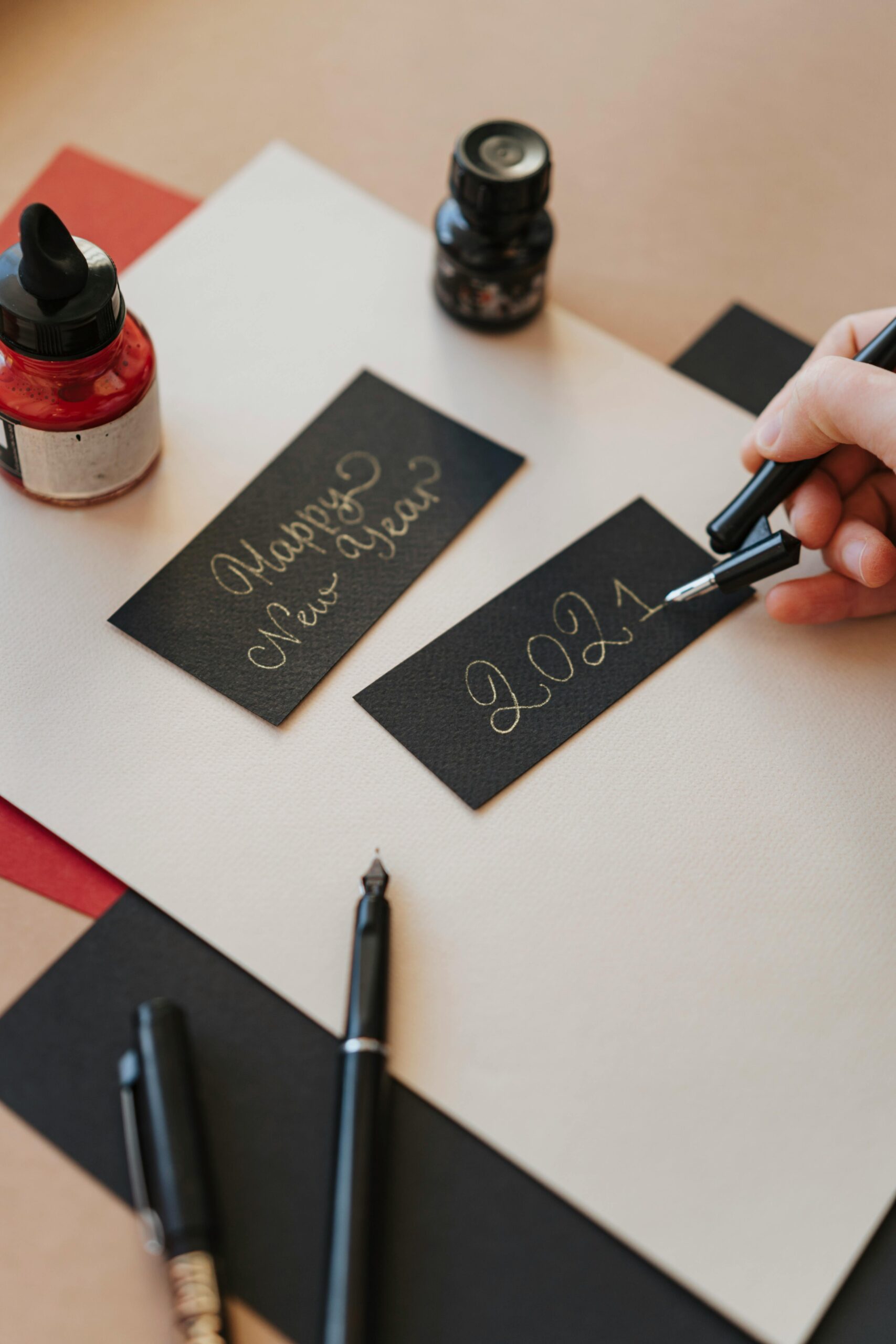
5. Using the Wrong Paper (The “Bleed” Issue)
Many beginners try to use standard printer paper, which is a recipe for disaster.
- The Mistake: Using porous paper that “feathers” the ink (the ink spreads out like a spiderweb).
- The Fix: Use “Sized” paper. In 2026, the gold standards for beginners are Rhodia pads or HP Premium 32lb paper. These have a smooth coating that allows the nib to glide and keeps the ink sitting on the surface for crisp edges.
6. Comparison: Beginner Tools for 2026
| Tool Type | Best for… | Pro Tip |
| Brush Pen | Modern Lettering / Signage | Start with a “Small Tip” (like Tombow Fudenosuke) for better control. |
| Fountain Pen | Everyday Elegance / Italic | Use “Document Ink” to prevent fading over time. |
| Dip Pen | Copperplate / Spencerian | Always clean your nib with a bit of glass cleaner after every session to prevent rust. |
7. Summary: The “Slow Art” Philosophy
The ultimate 2026 mistake is Rushing. Calligraphy is a meditative practice. If you find yourself holding your breath, stop. Take a deep breath, reset your posture, and focus on the rhythm of the ink rather than the final word.